With people surfing the web on smartphones, tablets and other mobile devices now more than ever, your business can't afford to not have a mobile-optimized site. Sites designed with mobile devices in mind are quickly become the rule, not the exception, and if your site isn't built for tapping and swiping on a small screen, its visitors won't stick around.
Responsive Design Included
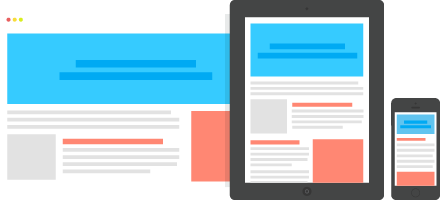
Don’t be restricted by the limitations of mobile web designs — mobile-optimized sites today are built using responsive design. This means that your site will automatically resize and reformat itself based on the size of the viewing window, so it stays beautiful and functional on screens of all sizes.
Curious about extra coding time and development costs? Don’t be. When we design and build websites using HubSpot tools, mobile-ready responsive design is always included. You get a better performing mobile site that retains the same look and feel across devices, improving the user experience in more ways than one.
Update Your Design
Want to implement responsive design on an existing website? No problem. We can migrate your existing website to HubSpot, making it responsive for mobile devices while giving you access to the software’s many other benefits. Even if your existing site was built using HubSpot, it may not have responsive design already—we have the resources to update it, though, so your site retains everything you love about it while adding so much more.
Want to learn more about the benefits that come standard with HubSpot?
Talk to us today to find out about web design, analytics and more.
Talk to Us